The Present Genocide is Real

Why Did US Deaths Shoot up 40 Percent Above Normal Last Year?
As we’ve seen over the past two years, data and statistics can be manipulated and skewed in a wide variety of ways.
One of the most reliable data points we have is all-cause mortality. It’s very hard to massage that statistic, as people are either dead or they’re not. Their inclusion in the national death index database is based on one primary criteria—they’ve died—regardless of the cause.
From there, their cause of death, as identified on their death certificate, is added in to more granular statistics, such as the number of people who died from cancer and heart disease in any given year, for example. But while the cause of any given death can be manipulated and altered, the fact that there was a death is more certain. What’s more, death rates tend to be very stable.
“We are seeing, right now, the highest death rates we have seen in the history of this business … death rates are up 40 percent over what they were prepandemic.” ~ Scott Davidson, CEO of OneAmerica
As noted in a (not peer-reviewed) study led by scientist Denis Rancourt, who looked at U.S. mortality between March 2020 and October 2021, “All-cause mortality by time is the most reliable data for detecting true catastrophic events causing death, and for gauging the population-level impact of any surge in deaths from any cause.”
40 Percent Rise in Deaths Among Working Americans
With that in mind, OneAmerica’s announcement that the death rate of working-age Americans (18 to 64), in the third quarter of 2021, was 40 percent higher than pre-pandemic levels is rather stunning. OneAmerica is a national mutual life insurance company based in Indianapolis. During an early January 2022 press conference, CEO Scott Davidson said:
“We are seeing, right now, the highest death rates we have seen in the history of this business — not just at OneAmerica. The data is consistent across every player in that business.
And what we saw just in third quarter, we’re seeing it continue into fourth quarter, is that death rates are up 40 percent over what they were pre-pandemic. Just to give you an idea of how bad that is, a three-sigma or a one-in-200-year catastrophe would be 10 percent increase over pre-pandemic. So, 40 percent is just unheard of.”
According to Davidson, a majority of the death claims filed are not classified as COVID-19 deaths, so something else is driving up the death rate. As reported by The Center Square:
“The CDC weekly death counts, which reflect the information on death certificates and so have a lag of up to eight weeks or longer, show that for the week ending Nov. 6, there were far fewer deaths from COVID-19 in Indiana compared to a year ago — 195 verses 336 — but more deaths from other causes — 1,350 versus 1,319.”
Disability Claims Have Also Risen
At the same time, OneAmerica has also noticed an uptick in disability claims. Initially, there was a rise in short-term disability claims, but now most claims are for long-term disabilities. The company expects the rise in claims will cost them “well over $100 million,” an unexpected expense that will be passed on to employers buying group life insurance policies.
During that press conference, Brian Tabor, president of the Indiana Hospital Association, confirmed Indiana hospitals are seeing a dramatic increase in both deaths and hospitalizations for a wide variety of conditions.
Not only are the number of hospitalizations in Indiana higher, it’s the highest it’s been in five years. Meanwhile, the daily deaths from COVID-19 are less than half that of 2020.
Same Trend Seen in Many Other States and Countries
As noted by Davidson, OneAmerica is not alone in seeing an unprecedented spike in excess deaths. It’s also not limited to the United States. The Insurance Regulatory and Development Authority of India, for example, also reports a 41 percent rise in death claims in 2021. That’s near-identical to the 40 percent increase reported by OneAmerica.
According to vaccine safety blogger Steve Kirsch, Phoenix, Arizona, is reporting a 100 percent rise in the death rate among city employees. In 2021, it was double that of the 10-year average. “There is clearly something going on that is not unique to Indiana,” he writes, adding:
“Excess mortality figures in Europe and the UK seem to show younger people are dying faster than the elderly, and that people 0-14 are dying faster in the second half of 2021 as compared to the first.”
Safety Signal Is Indisputable
As cardiologist Dr. Peter McCullough has repeatedly stated, we had a clear safety signal all the way back in February 2021, and it’s only gotten more pronounced over time. Despite that, not a single safety review has been conducted, and our health authorities refuse to address the astronomical death toll.
Doctors have identified several effective treatment options that can slash the COVID death rate by 85 percent or more. We could have avoided all these excess deaths by making sure early treatment was given, rather than exclusively relying on a vaccine.
Early Treatment Options
While the overall risk of COVID-19 has been grossly exaggerated, early treatment is key, both for preventing severe infection and preventing “long-haul COVID.” Here are a few suggestions:
- Vitamin D optimization — Research has shown having a vitamin D level above 50 ng/mL brings the risk of COVID mortality down to near-zero.
- Other key nutraceuticals — Vitamin C, zinc, quercetin, and NAC all have scientific backing.
- Key drugs — For acute infection, ivermectin,
hydroxychloroquine, or monoclonal antibodies can be used. While
monoclonal antibodies and hydroxychloroquine must be used early on in
the disease process, ivermectin has been shown to be effective in all
stages of the infection.
Doxycycline or azithromycin are typically added as well, to address any secondary bacterial infection, as well as inhaled budesonide (a steroid). Oral steroids are used on and after the fifth day for pulmonary weakness and aspirin or NAC can be added to reduce the risk of clotting.Full-strength aspirin is also typically recommended, but I believe lumbrokinase and serrapeptase may be a better, at least safer, alternative, as they help break down and prevent blood clots naturally.
- Nature of the COVID-era public health disaster in the USA
- The Center Square January 1, 2022
- Stevekirsch.substack January 3, 2022
- Roundingtheearth.substack January 3, 2022
- Euromomo.eu Data as of Week 52, 2021
- CDC MMWR October 29, 2021; 70(43): 1520-1524
- medRxiv August 17, 2021 DOI: 10.1101/2021.08.16.21262044
- EMPR.com February 6, 2020
- The Journal of Pediatrics September 2007; 151(3): 266-270.el
- Orthomolecular Medicine May 10, 2021
- Nutrients October 2021; 13(10): 3596
Confirmation of information:
(Bond Robin Note: Milo Mac makes the claim that he can separate the "Covid-19" deaths from the non-covid deaths. Since to this day there is not a test capable of isolating and proving Covid infection, all he has to say about it is based on spurious "science." This writer seems biased to prove that the deaths were natural and not vaccine induced, when the only mass change in the period is the vaccine rollout.)
A few weeks ago, Edward Dowd presented a data set on Steve Bannon’s WarRoom that showed excess mortality by month for various age ranges. See here.In the interview, Ed describes the work an associate of his, an actuary, did with regards to developing the charts for each age. Through my communications with Ed on Gettr, I offered to see if I could reproduce the charts from the raw data.
Ed describes some work that needed to be done with the original data to develop baselines for each age group in order to calculate excess death percentages. Presumably, this is because the original data set had a base line in aggregate but not for specific age groups.
I began with the original data set and also created baselines for each age. Admittedly, I took a couple of short cuts with regard to expect average deaths and seasonality but I figured with the level of disruption we are seeing, it would be close enough to confirm Ed’s work.
I was right. My development match Ed’s close enough to confirm it. However, while doing additional research, I came upon a CDC data set that already included baseline expected deaths by age group. Not only the age groups used by Ed, but even more granular at 5 year intervals. It also delineated by gender and ethnicity.
The data set can be found here:
See this Gettr post if you want to derive the percentages yourself. If you know how to create a pivot table in Excel, it takes less than 5 minutes.
What this means is that I can now create versions of Ed’s charts based on CDC baselining methodologies (they confirm Ed’s - see below) but I can also dig in deeper and create comparable charts for various sub-groupings.
The data set also delineated COVID versus Non-COVID excess deaths. This is a split that was not present in Ed‘S development and, as we will see, adds a level of complexity in understanding what the data is telling us (I encourage you not to rush to judgement once you see the charts).
Before I discussed this any further, here is my development. For each age grouping, I include my aggregate chart, a chart that breaks it apart by COVID and Non-COVID and a chart that overlay’s Ed’s chart to show how they compared.
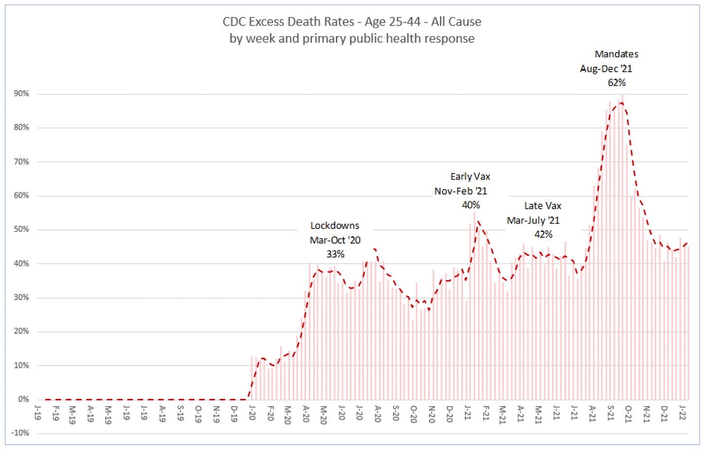
Let’s start with the Millennials.
Ages 25-44
Here is my version of the Millennial chart based on the CDC data.
Here is the chart that breaks out COVID and Non-COVID

Here is the overlay for comparison to Ed’s. You can see they are very close. What I found is that for each of the age groups, my percentages are slightly higher than Ed’s. I noticed the same thing when I compared my derived percentages to the CDC numbers so it may have to do with a slight bias in developing the base line. In any event, the differences are small relative to the level of excess deaths.

What you probably noticed right off the bat in the second chart is that the bump in excess percentage deaths from August to December 2021 appears to be driven by an increase in COVID rather than an increase in Non-COVID (e.g. including vaccines) deaths. This is where we need to take a step back and think it through.
The stacked bar chart showing the COVID and Non-COVID contribution to excess deaths shows a pronounced increase in COVID deaths in third and fourth quarters of 2021. This coincides with the introduction of mandates but also with the Delta variant surge in the United States. The question is raised as to whether the substantial spike in excess deaths from August 2021 to December 2021 is related to the vaccines or is it simply just more COVID?
I believe the answer may be a combination of things. Consider the following:
We know that COVID deaths are overstated, for at least two reasons. The first is high cycle PCR tests that overstate positive results. (Bond Note: This is fantasy, ALL positive PCR tests are false positives.) The second reason has to do with how COVID is determined to be the cause of death. CDC guidance instructs practitioners to include COVID as the cause if there is a positive PCR test but also if they suspect COVID or determine it was likely even without a lab test.
From the Technical Note:

CDC counts COVID deaths two ways. Essentially, dying from COVID and dying with COVID. The total COVID deaths included in the presented charts include both since that is how CDC reports them. Additional work should be done to adjust the COVID deaths to remove “dying with COVID”.
But even if the COVID increase is real in the August to December 2021 time frame, consider three things.
The percent in Non-COVID excess deaths also increases in this time frame compared to earlier periods and in some cells (age, gender, ethnicity) by significant amount. This should have nothing to do with the delta variant.
Then there is Vaccine-Associated Enhanced Disease. This is where a vaccine causes more severe disease the next time an inoculated person comes in contact with a variant of the original strain. The FDA identified this as a risk for COVID vaccines in the original Pfizer and Moderna briefing documents.

In addition, some evidence coming out of Scotland, England and New Zealand appear to show that VAED is happening.
A corollary to VAED is Antibody Depdendent Enhancement (ADE) which can occur as the vaccines wane. This was also identified in the original review documents. We also know that the August to December time frame coincides with the time the vaccines were expected to be waning.
So what would it look like in the data if VAED or ADE was occurring? Well, wouldn’t it look like exactly what we see? Soon after widespread vaccination, we are exposed to a variant (delta) and we see what could be considered a disproportionate spike in COVID deaths even among the younger and healthier population.
So, while we know COVID deaths tend to be overstated, it is possible that the spike we are seeing in the 3Q and 4Q of 2021 in deaths being attributed to COVID could be evidence of VAED.
More work can and should be done on this. The CDC has released data on COVID deaths with associated comorbidities that might be used to tease out additional insights. Additionally, we can look at COVID growth in the the 3Q and 4Q 2021 by age correlated to percent vaccinated.
While COVID deaths do increase dramatically in the 3Q and 4Q 2021 for Millenials, we do see Non-COVID deaths also increase. Here is another view that shows that. This is a heat map that shows Non-COVID, COVID and Total Deaths for Ages 25-44 for the years 2019 through 2021. Green is low and red is high. You clearly see the spike in COVID deaths in the 3Q 2021. But you also see some read in the Non-COVID for that period.

We know from VAERS that there are vaccine deaths in the 2021 deaths somewhere in these charts. We just need to tease them out.
One thing we haven’t talked about yet are the excess deaths for Non-COVID starting in early 2020 right after the lockdowns started. In fact, looking at the Non-COVID/COVID chart above, what you see is that Non-COVID excess deaths dramatically outnumbered COVID deaths for all of 2020 and through 2021 until the COVID surge in 2021. That is important. What is causing so much excess death unrelated to COVID? I have some ideas and will be exploring that further.
I realized that I may have made an assumption that you might also have made when looking at Ed’s chart. I assumed that COVID deaths were constant and Non-COVID volumes were changing. And while Non-COVID deaths do increase in August 2021, I was very surprised to see them so high so early in the pandemic. That should not be overlooked.
That brings me to the end of this post. There is a lot to cover given the level of granularity with which the data can be examined. I will be posting to this sub stack and will link to it from GETTR. This sub stack will remain free to all.
Finally, here are the charts for the remaining age groups.
Ages 45-64 Gen X:


Ages 65+ Boomers:


Subscribe to Milo Mac Newsletter
COVID Data Research


Comments
Post a Comment